Browse the Full Catalog
Cybrary’s comprehensive, framework-aligned catalog has been reorganized to provide you with an intentional, guided learning experience. Advance your career, prep for certifications, and build your skills whenever, wherever.




The content and tools you need to build real-world skills
Rapidly develop your skills via an integrated and engaging learning
experience on the Cybrary platform.
Bite-sized Video Training
Manageable instruction from industry experts
Hands-On Learning
Put your skills to the test in virtual labs, challenges, and simulated environments
Practice Exams
Prepare for industry certifications with insider tips and practice exams
Earn Industry Badges
Complete coursework to earn industry-recognized badges via Credly
AI Curriculum

AI Fundamentals
Learn the basics of Artificial Intelligence! This skill path is designed to provide you with a general understanding of Artificial Intelligence, and how to deploy and secure it within the enterprise. Upon completing the skill path, you will earn a Credly digital badge that will demonstrate to employers that you’re ready for the job.
AI Scams
In this brief course, you will learn the basics of AI scams. AI scams are cyberattacks that use artificial intelligence to trick people. They create emails, videos, voice messages, or websites that look, sound, and read like the real thing, making them far more convincing and harder to detect than traditional scams.
Deepfake Awareness
In this brief course, you will learn the basics of deepfakes as part of your required Security Awareness Training. Deepfakes are synthetic media, usually videos, images, or audio, created using artificial intelligence to convincingly mimic real people. They can make someone appear to say or do something they never actually did.
Certification Prep
CompTIA Tech+ (FC0-U71)
CompTIA Tech+ is a beginner-level certification and is perfect for you if you are considering a new career or career change to the IT industry. This certification prep path is designed to provide you with a comprehensive overview of the concepts and skills you will need to pass the certification exam.
Skill Paths

Governance
Governance is the system of rules, practices, and processes used to direct and control a company. This skill path is designed to provide you with a general understanding of how to align business objectives with ethical practices for how a company operates. Upon completing the skill path, you will earn a Credly digital badge that will demonstrate to employers that you’re ready for the job.

Compliance
Compliance is the act of adhering to all relevant laws, regulations, industry standards (external), and internal policies and controls (corporate). This skill path is designed to provide you with a general understanding of how to ensure an organization operates within legal and ethical boundaries to avoid fines, penalties, and reputational damage. Upon completing the skill path, you will earn a Credly digital badge that will demonstrate to employers that you’re ready for the job.

Cybersecurity Leadership
Becoming an effective Cybersecurity Leader requires you to consider traditional Leadership competencies through a security-centric lens. This skill path is designed to provide you with a general understanding of cybersecurity leadership. Upon completing the skill path, you will earn a Credly digital badge that will demonstrate to employers that you’re ready for the job.

Collaborative Leadership
Collaborative Leadership is the skillset required to work effectively with others. This skill path is designed to provide you with a general understanding of the collaborative skills required to be a successful leader. Upon completing the skill path, you will earn a Credly digital badge that will demonstrate to employers that you’re ready for the job.

Soft Skills
Soft Skills are the traits required for positive and constructive interactions with other people. This skill path is designed to provide you with a general understanding of the soft skills required to be a successful leader. Upon completing the skill path, you will earn a Credly digital badge that will demonstrate to employers that you’re ready for the job.

Incident Response
Incident Response is the rapid response function that addresses high-impact security events in real time. This skill path is designed to provide you with a general understanding of Incident Response as both a skill set and work role. Upon completing the skill path, you will earn a Credly digital badge that will demonstrate to employers that you’re ready for the job.
Career Paths
-p-500%5B1%5D.webp)
Leadership and Management
Effective Leadership and Management is critical to any security-related function. This career path is designed to provide you with the foundational knowledge and key skills required to succeed as an effective leader within any security domain. Upon completing the career path, you will earn a Credly digital badge that will demonstrate to employers that you’re ready for the job.

GRC Analyst
Every successful cybersecurity program requires judicious risk management and informed oversight. This career path is designed to provide you with the foundational knowledge and key skills required to succeed as a GRC Analyst or in any role that involves managing governance, risk, and compliance. Upon completing the career path, you will earn a Credly digital badge that will demonstrate to employers that you’re ready for the job.
Security Awareness Training

Secure AI Research
Learn to align AI research with secure principles to ensure due care and faster approvals. You will prioritize adversarial risks using MITRE and OWASP LLM Top 10, design data protection controls for privacy and integrity, build an evaluation process, select safe integration patterns, and communicate risk to review boards with audit-ready artifacts.

AI Scams
In this brief course, you will learn the basics of AI scams. AI scams are cyberattacks that use artificial intelligence to trick people. They create emails, videos, voice messages, or websites that look, sound, and read like the real thing, making them far more convincing and harder to detect than traditional scams.

Impersonation Scams
In this brief course, you will learn the basics of impersonation scams as part of your required Security Awareness Training. Impersonation scams happen when cybercriminals pretend to be someone you know and trust. They use urgency, realistic details, and familiar names to pressure you into acting fast, often before you have time to think or verify.
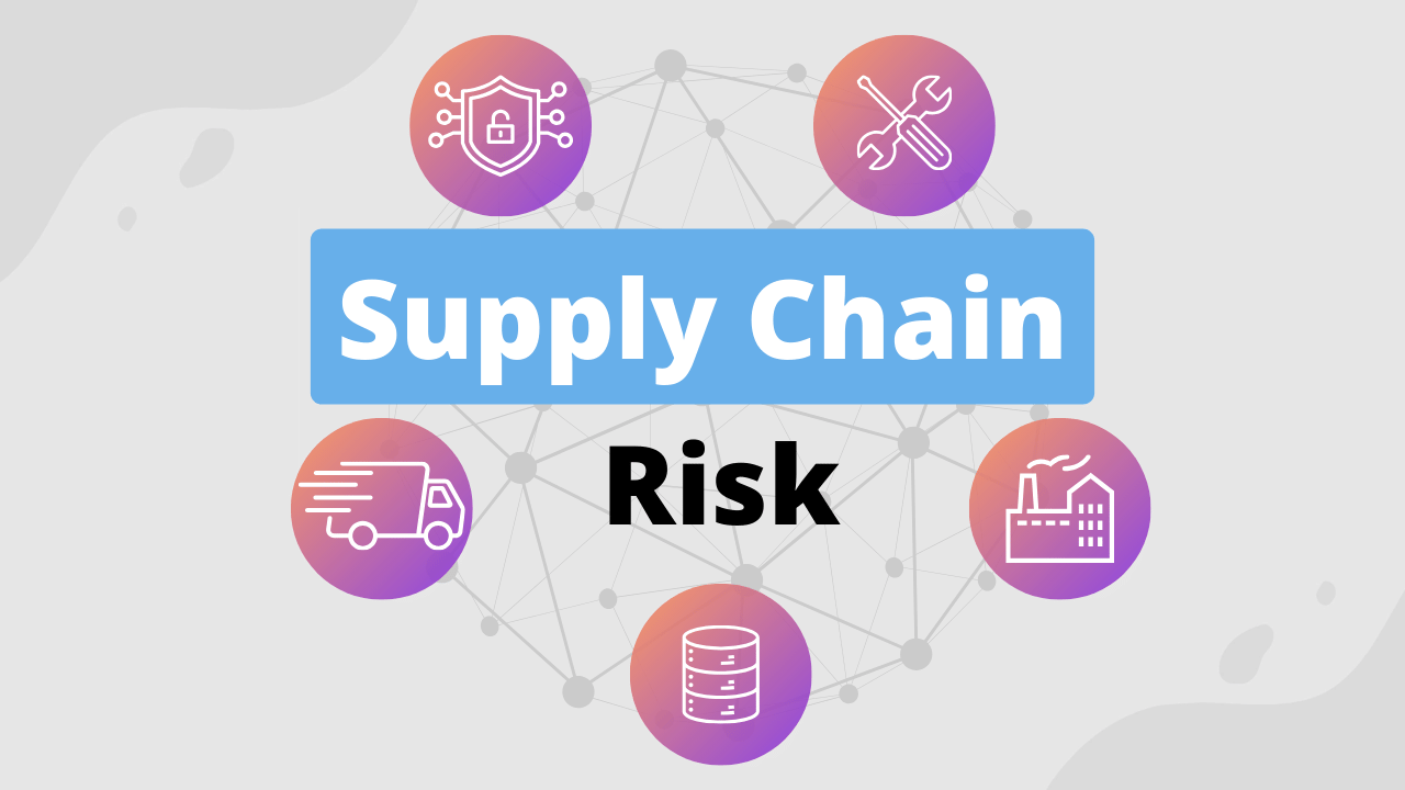
Supply Chain Risk
In this brief course, you will learn the basics of supply chain risk as part of your required Security Awareness Training. Supply chain risk is the cybersecurity threat that comes from the businesses you depend on, like suppliers, vendors, and service providers, rather than direct attacks on your own systems.

Deepfake Awareness
In this brief course, you will learn the basics of deepfakes as part of your required Security Awareness Training. Deepfakes are synthetic media, usually videos, images, or audio, created using artificial intelligence to convincingly mimic real people. They can make someone appear to say or do something they never actually did.
Collections

Server Software Component: Web Shell
Bad actors can gain persistence on your network by abusing software development features that allow legitimate developers to extend server applications. In this way, they can install malicious code for later use. Learn to detect and thwart this activity and protect your network.

SSH Authorized Keys
SSH Authorized Keys are widely used as credentials for remotely accessing Linux-based systems via SSH. Adversaries can manipulate these keys to give themselves persistence in your environment so they can return at will. Get hands-on detecting and mitigating this adversary action today.

Practical Threat Modeling
This course provides an in-depth exploration of advanced threat modeling techniques. It covers essential tools like MITRE ATT&CK Navigator and Deciduous, and guides you through developing detailed threat models for complex environments. Learn to visualize attack paths and conduct thorough threat modeling workshops.

Royal Ransomware Group
Royal is a spin-off group of Conti, which first emerged in January of 2022. The group consists of veterans of the ransomware industry and brings more advanced capabilities and TTPs against their victims. Begin this campaign to learn how to detect and protect against this newer APT group!

Raspberry Robin
Raspberry Robin is a malware family that continues to be manipulated by several different threat groups for their purposes. These threat actors (Clop, LockBit, and Evil Corp) specialize in establishing persistence on a compromised host and creating remote connections to use later. Once established, these C2 connections can be used for multiple purposes, including data exfiltration, espionage, and even further exploitation.

Double Trouble with Double Dragon

Weak Link in the Supply Chain

Ransomware for Financial Gain
Threat actors continue to leverage ransomware to extort victim organizations. What was once a simple scheme to encrypt target data has expanded to include data disclosure and targeting a victim’s clients or suppliers. Understanding the techniques threat actors use in these attacks is vital to having an effective detection and mitigation strategy.

CVE Series: Apache HugeGraph Server Gremlin Query Language RCE (CVE-2024-27348)
CVE-2024-27348 is a critical vulnerability in Apache HugeGraph, a graph database designed for large-scale data management. With a CVSS score of 9.8, attackers can exploit this flaw by sending crafted payloads to execute arbitrary commands, potentially leading to a full system compromise.

CVE Series: aiohttp Directory Traversal Vulnerability (CVE-2024-23334)
CVE-2024-23334 is a high severity vulnerability found in the aiohttp Python library, a popular asynchronous HTTP client/server framework. By the end of this course you will be able to execute a directory traversal attack using aiohttp's vulnerable configuration and then perform remediation steps to fix the vulnerability.

CVE Series: VFS Escape in CrushFTP (CVE-2024-4040)
CVE-2024-4040 is a critical vulnerability in CrushFTP, a Java-based robust file server. Rated with a CVSS score of 10, this flaw permits remote, unauthorized attackers to circumvent authentication mechanisms, thereby gaining remote code execution (or RCE). In this course you’ll explore, exploit, and remediate this CVE.

CVE Series: Authentication Bypass Leading to Remote Code Execution (RCE) in JetBrains TeamCity (CVE-2024-27198)
CVE-2024-27198 is a critical vulnerability in JetBrains TeamCity, a Java-based open-source automation server used for application building. This flaw allows remote, unauthorized attackers to circumvent authentication, thereby gaining admin control over the server. All versions of TeamCity On-Premises up to 2023.11.3 are affected.

CVE Series: Jenkins Arbitrary File Leak Vulnerability (CVE-2024-23897)
CVE-2024-23897 is a critical security flaw affecting Jenkins, a Java-based open-source automation server widely used for application building, testing, and deployment. It allows unauthorized access to files through the Jenkins integrated command line interface (CLI), potentially leading to remote code execution (RCE).

CVE Series: “Leaky Vessels” Container Breakout (CVE-2024-21626)
CVE-2024-21626 is a severe vulnerability affecting all versions of runc up to 1.1.11, a critical component utilized by Docker and other containerization technologies like Kubernetes. This vulnerability enables an attacker to escape from a container to the underlying host operating system. Put on your red team hat to exploit this vulnerability.
OWASP Top 10 - A01:2021 - Broken Access Control
OWASP Top 10 - A02:2021 - Cryptographic Failures

OWASP Top 10 - A03:2021 - Injection

OWASP Top 10 - A04:2021 - Insecure Design

OWASP Top 10 - A05:2021 - Security Misconfiguration
OWASP Top 10 - A06:2021 - Vulnerable and Outdated Components
Registry Run Keys
Many organizations do not monitor for additions to the Windows Registry that could be used to trigger autostart execution on system boot or logon. This allows adversaries to launch programs that run at higher privileges and paves the way for more damaging activity. Learn how to detect and mitigate this activity to secure your network.
Scheduled Task
Some organizations do not configure their operating systems and account management to properly protect the use of task scheduling functionality. As a result, adversaries can abuse this capability to execute malicious code on a victim’s system. Get hands-on practice detecting this technique so you can protect your organization.

User Discovery

Server Software Component: Web Shell
Bad actors can gain persistence on your network by abusing software development features that allow legitimate developers to extend server applications. In this way, they can install malicious code for later use. Learn to detect and thwart this activity and protect your network.

Exfiltration Over Alternative Protocol and Clear CLI History
Our Instructors
Industry seasoned. Cybrary trained.
Our instructors are current cybersecurity professionals trained by Cybrary to deliver engaging, consistent, quality content.


