Browse the Full Catalog
Cybrary’s comprehensive, framework-aligned catalog has been reorganized to provide you with an intentional, guided learning experience. Advance your career, prep for certifications, and build your skills whenever, wherever.

The content and tools you need to build real-world skills
Rapidly develop your skills via an integrated and engaging learning
experience on the Cybrary platform.
Bite-sized Video Training
Manageable instruction from industry experts
Hands-On Learning
Put your skills to the test in virtual labs, challenges, and simulated environments
Practice Exams
Prepare for industry certifications with insider tips and practice exams
Earn Industry Badges
Complete coursework to earn industry-recognized badges via Credly
AI Curriculum

AI Fundamentals
Learn the basics of Artificial Intelligence! This skill path is designed to provide you with a general understanding of Artificial Intelligence, and how to deploy and secure it within the enterprise. Upon completing the skill path, you will earn a Credly digital badge that will demonstrate to employers that you’re ready for the job.
AI Scams
In this brief course, you will learn the basics of AI scams. AI scams are cyberattacks that use artificial intelligence to trick people. They create emails, videos, voice messages, or websites that look, sound, and read like the real thing, making them far more convincing and harder to detect than traditional scams.
Deepfake Awareness
In this brief course, you will learn the basics of deepfakes as part of your required Security Awareness Training. Deepfakes are synthetic media, usually videos, images, or audio, created using artificial intelligence to convincingly mimic real people. They can make someone appear to say or do something they never actually did.
Certification Prep
CompTIA Tech+ (FC0-U71)
CompTIA Tech+ is a beginner-level certification and is perfect for you if you are considering a new career or career change to the IT industry. This certification prep path is designed to provide you with a comprehensive overview of the concepts and skills you will need to pass the certification exam.
Skill Paths
Governance
Governance is the system of rules, practices, and processes used to direct and control a company. This skill path is designed to provide you with a general understanding of how to align business objectives with ethical practices for how a company operates. Upon completing the skill path, you will earn a Credly digital badge that will demonstrate to employers that you’re ready for the job.
Compliance
Compliance is the act of adhering to all relevant laws, regulations, industry standards (external), and internal policies and controls (corporate). This skill path is designed to provide you with a general understanding of how to ensure an organization operates within legal and ethical boundaries to avoid fines, penalties, and reputational damage. Upon completing the skill path, you will earn a Credly digital badge that will demonstrate to employers that you’re ready for the job.

Cybersecurity Leadership
Becoming an effective Cybersecurity Leader requires you to consider traditional Leadership competencies through a security-centric lens. This skill path is designed to provide you with a general understanding of cybersecurity leadership. Upon completing the skill path, you will earn a Credly digital badge that will demonstrate to employers that you’re ready for the job.

Collaborative Leadership
Collaborative Leadership is the skillset required to work effectively with others. This skill path is designed to provide you with a general understanding of the collaborative skills required to be a successful leader. Upon completing the skill path, you will earn a Credly digital badge that will demonstrate to employers that you’re ready for the job.

Soft Skills
Soft Skills are the traits required for positive and constructive interactions with other people. This skill path is designed to provide you with a general understanding of the soft skills required to be a successful leader. Upon completing the skill path, you will earn a Credly digital badge that will demonstrate to employers that you’re ready for the job.

Incident Response
Incident Response is the rapid response function that addresses high-impact security events in real time. This skill path is designed to provide you with a general understanding of Incident Response as both a skill set and work role. Upon completing the skill path, you will earn a Credly digital badge that will demonstrate to employers that you’re ready for the job.
Career Paths


-p-500%5B1%5D.webp)
Leadership and Management
Effective Leadership and Management is critical to any security-related function. This career path is designed to provide you with the foundational knowledge and key skills required to succeed as an effective leader within any security domain. Upon completing the career path, you will earn a Credly digital badge that will demonstrate to employers that you’re ready for the job.

GRC Analyst
Every successful cybersecurity program requires judicious risk management and informed oversight. This career path is designed to provide you with the foundational knowledge and key skills required to succeed as a GRC Analyst or in any role that involves managing governance, risk, and compliance. Upon completing the career path, you will earn a Credly digital badge that will demonstrate to employers that you’re ready for the job.
Security Awareness Training
Secure AI Research
Learn to align AI research with secure principles to ensure due care and faster approvals. You will prioritize adversarial risks using MITRE and OWASP LLM Top 10, design data protection controls for privacy and integrity, build an evaluation process, select safe integration patterns, and communicate risk to review boards with audit-ready artifacts.
AI Scams
In this brief course, you will learn the basics of AI scams. AI scams are cyberattacks that use artificial intelligence to trick people. They create emails, videos, voice messages, or websites that look, sound, and read like the real thing, making them far more convincing and harder to detect than traditional scams.
Impersonation Scams
In this brief course, you will learn the basics of impersonation scams as part of your required Security Awareness Training. Impersonation scams happen when cybercriminals pretend to be someone you know and trust. They use urgency, realistic details, and familiar names to pressure you into acting fast, often before you have time to think or verify.
Supply Chain Risk
In this brief course, you will learn the basics of supply chain risk as part of your required Security Awareness Training. Supply chain risk is the cybersecurity threat that comes from the businesses you depend on, like suppliers, vendors, and service providers, rather than direct attacks on your own systems.

Deepfake Awareness
In this brief course, you will learn the basics of deepfakes as part of your required Security Awareness Training. Deepfakes are synthetic media, usually videos, images, or audio, created using artificial intelligence to convincingly mimic real people. They can make someone appear to say or do something they never actually did.
Collections


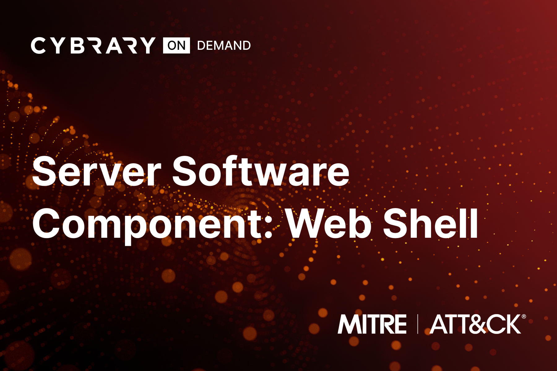
Server Software Component: Web Shell
Bad actors can gain persistence on your network by abusing software development features that allow legitimate developers to extend server applications. In this way, they can install malicious code for later use. Learn to detect and thwart this activity and protect your network.
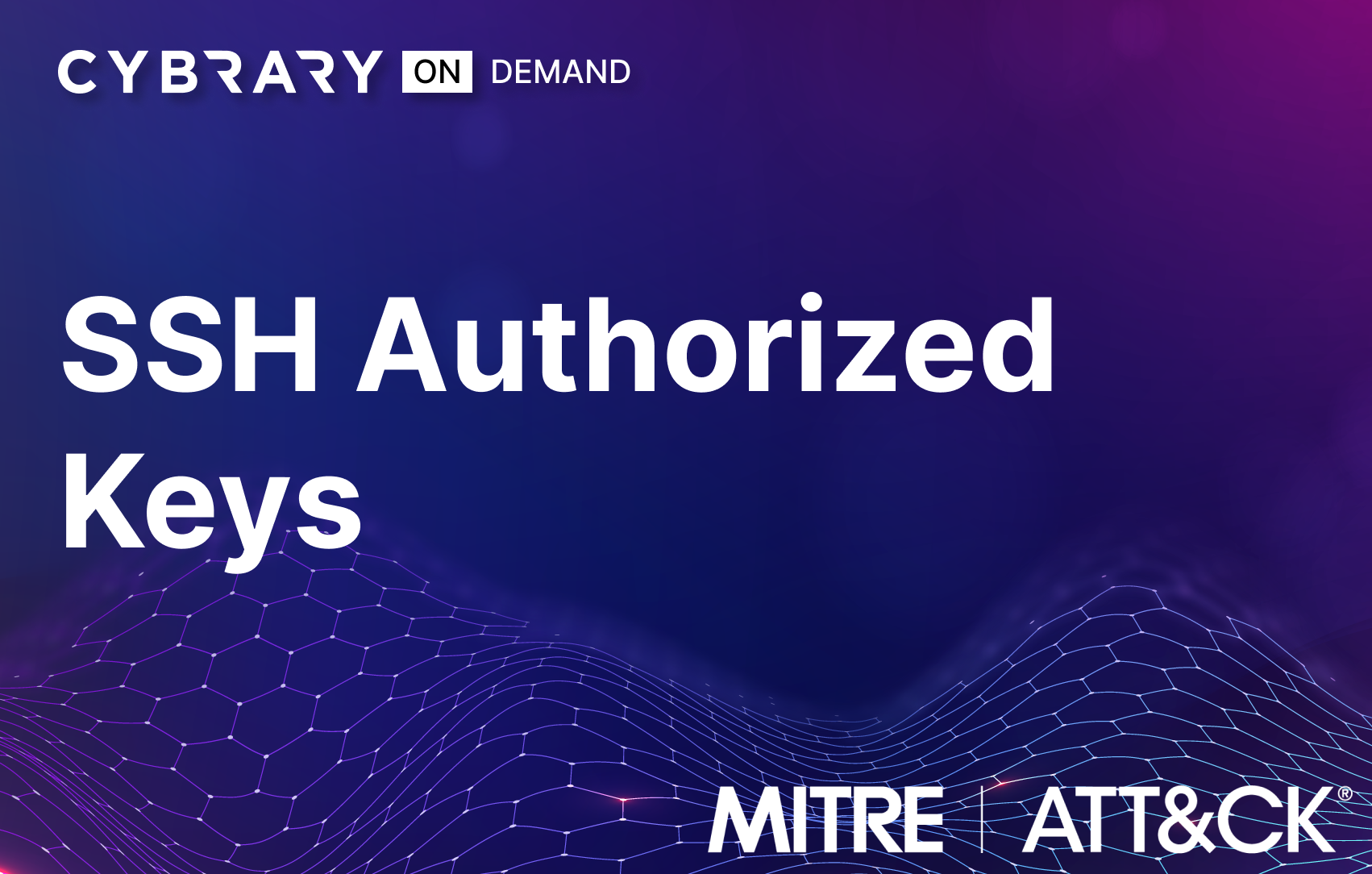
SSH Authorized Keys
SSH Authorized Keys are widely used as credentials for remotely accessing Linux-based systems via SSH. Adversaries can manipulate these keys to give themselves persistence in your environment so they can return at will. Get hands-on detecting and mitigating this adversary action today.

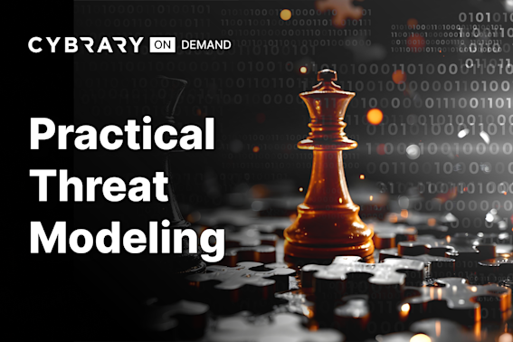
Practical Threat Modeling
This course provides an in-depth exploration of advanced threat modeling techniques. It covers essential tools like MITRE ATT&CK Navigator and Deciduous, and guides you through developing detailed threat models for complex environments. Learn to visualize attack paths and conduct thorough threat modeling workshops.
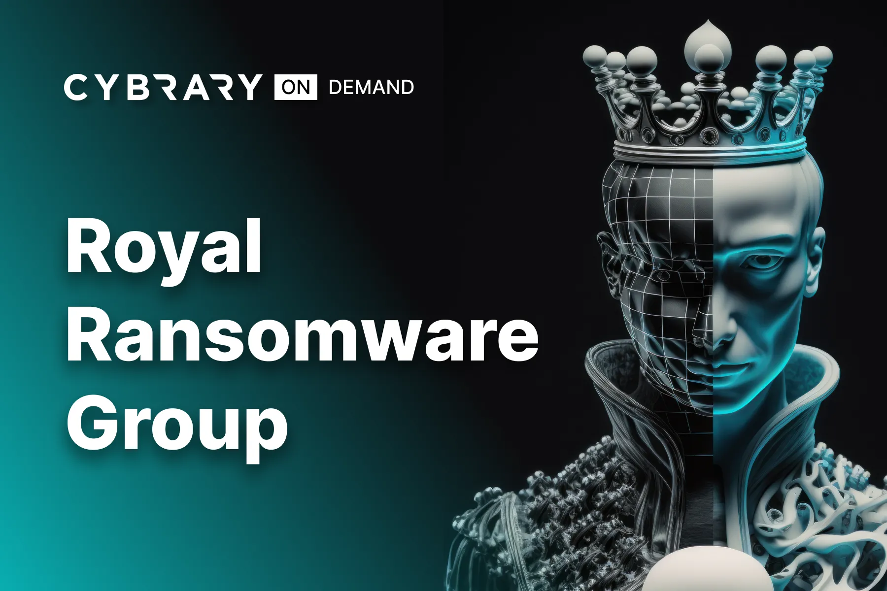
Royal Ransomware Group
Royal is a spin-off group of Conti, which first emerged in January of 2022. The group consists of veterans of the ransomware industry and brings more advanced capabilities and TTPs against their victims. Begin this campaign to learn how to detect and protect against this newer APT group!

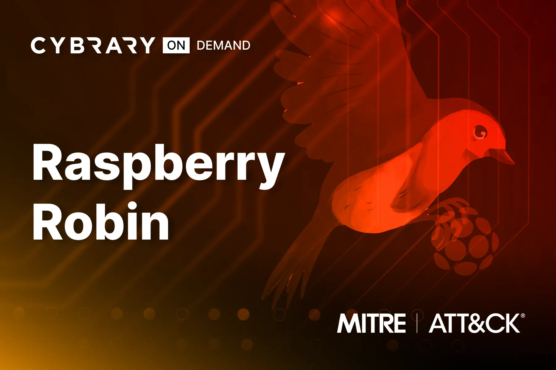
Raspberry Robin
Raspberry Robin is a malware family that continues to be manipulated by several different threat groups for their purposes. These threat actors (Clop, LockBit, and Evil Corp) specialize in establishing persistence on a compromised host and creating remote connections to use later. Once established, these C2 connections can be used for multiple purposes, including data exfiltration, espionage, and even further exploitation.
Double Trouble with Double Dragon
Weak Link in the Supply Chain
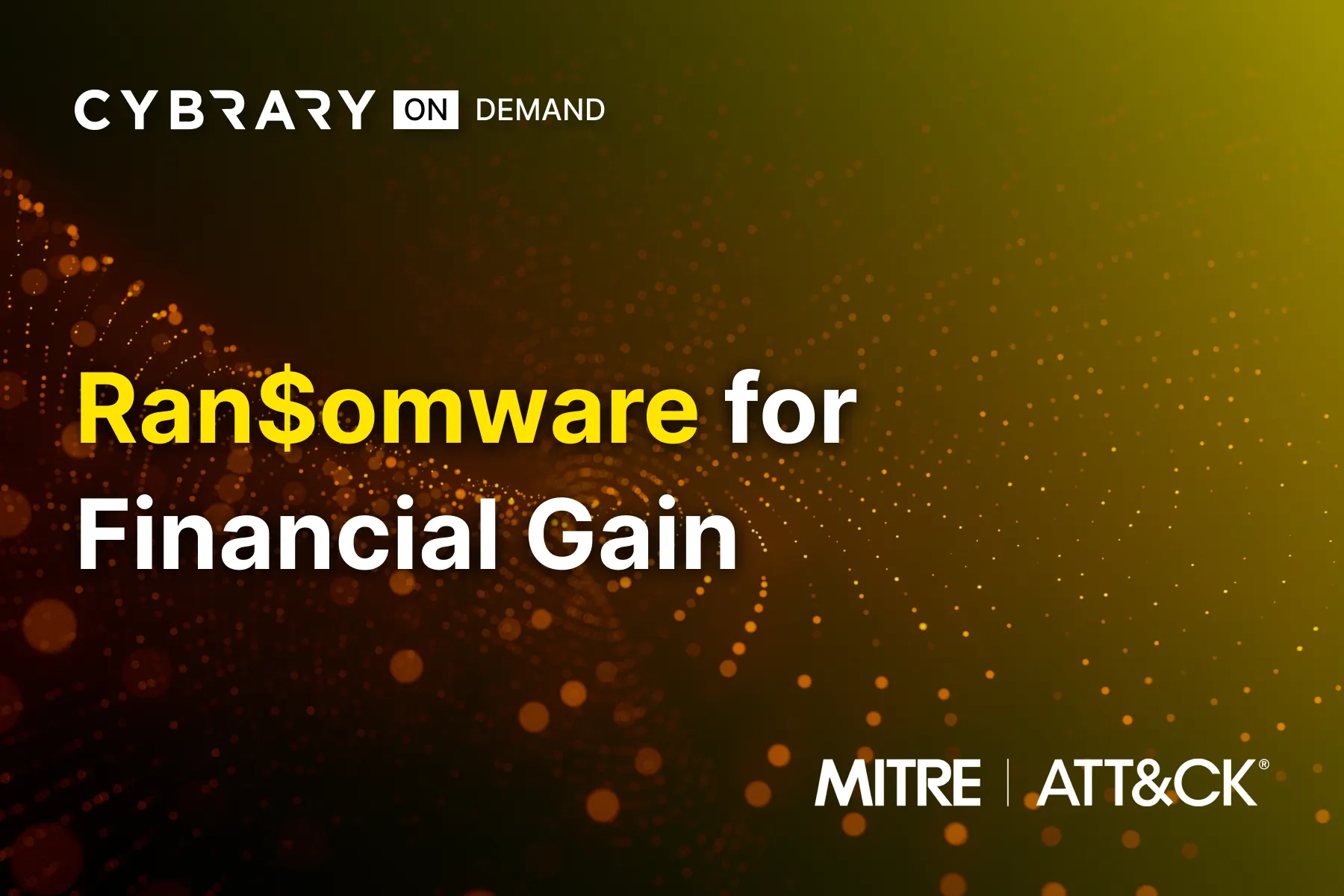
Ransomware for Financial Gain
Threat actors continue to leverage ransomware to extort victim organizations. What was once a simple scheme to encrypt target data has expanded to include data disclosure and targeting a victim’s clients or suppliers. Understanding the techniques threat actors use in these attacks is vital to having an effective detection and mitigation strategy.
CVE Series: Apache HugeGraph Server Gremlin Query Language RCE (CVE-2024-27348)
CVE-2024-27348 is a critical vulnerability in Apache HugeGraph, a graph database designed for large-scale data management. With a CVSS score of 9.8, attackers can exploit this flaw by sending crafted payloads to execute arbitrary commands, potentially leading to a full system compromise.
CVE Series: aiohttp Directory Traversal Vulnerability (CVE-2024-23334)
CVE-2024-23334 is a high severity vulnerability found in the aiohttp Python library, a popular asynchronous HTTP client/server framework. By the end of this course you will be able to execute a directory traversal attack using aiohttp's vulnerable configuration and then perform remediation steps to fix the vulnerability.
CVE Series: VFS Escape in CrushFTP (CVE-2024-4040)
CVE-2024-4040 is a critical vulnerability in CrushFTP, a Java-based robust file server. Rated with a CVSS score of 10, this flaw permits remote, unauthorized attackers to circumvent authentication mechanisms, thereby gaining remote code execution (or RCE). In this course you’ll explore, exploit, and remediate this CVE.
CVE Series: Authentication Bypass Leading to Remote Code Execution (RCE) in JetBrains TeamCity (CVE-2024-27198)
CVE-2024-27198 is a critical vulnerability in JetBrains TeamCity, a Java-based open-source automation server used for application building. This flaw allows remote, unauthorized attackers to circumvent authentication, thereby gaining admin control over the server. All versions of TeamCity On-Premises up to 2023.11.3 are affected.
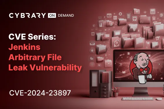
CVE Series: Jenkins Arbitrary File Leak Vulnerability (CVE-2024-23897)
CVE-2024-23897 is a critical security flaw affecting Jenkins, a Java-based open-source automation server widely used for application building, testing, and deployment. It allows unauthorized access to files through the Jenkins integrated command line interface (CLI), potentially leading to remote code execution (RCE).
CVE Series: “Leaky Vessels” Container Breakout (CVE-2024-21626)
CVE-2024-21626 is a severe vulnerability affecting all versions of runc up to 1.1.11, a critical component utilized by Docker and other containerization technologies like Kubernetes. This vulnerability enables an attacker to escape from a container to the underlying host operating system. Put on your red team hat to exploit this vulnerability.
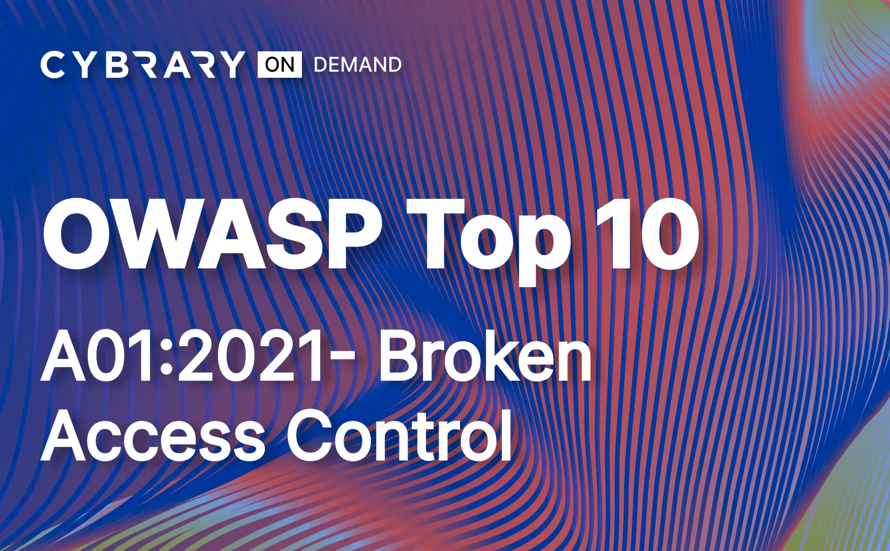
OWASP Top 10 - A01:2021 - Broken Access Control
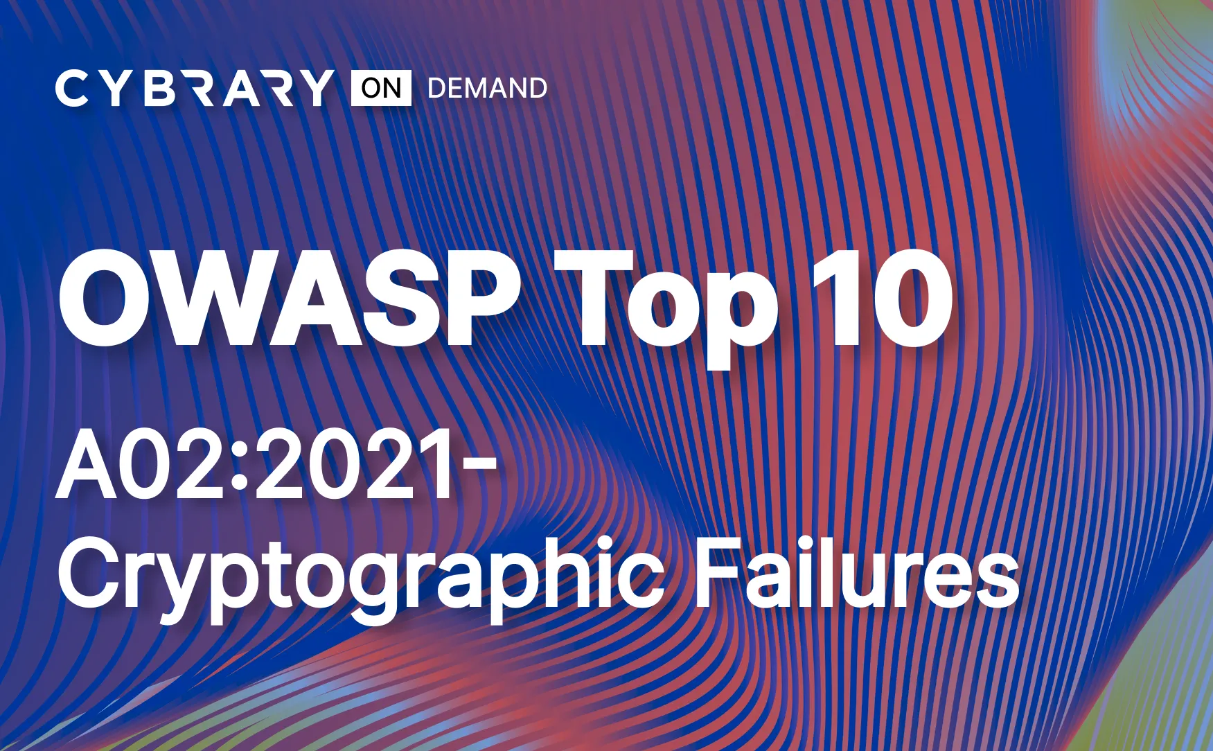
OWASP Top 10 - A02:2021 - Cryptographic Failures
OWASP Top 10 - A03:2021 - Injection
OWASP Top 10 - A04:2021 - Insecure Design
OWASP Top 10 - A05:2021 - Security Misconfiguration
OWASP Top 10 - A06:2021 - Vulnerable and Outdated Components
Registry Run Keys
Many organizations do not monitor for additions to the Windows Registry that could be used to trigger autostart execution on system boot or logon. This allows adversaries to launch programs that run at higher privileges and paves the way for more damaging activity. Learn how to detect and mitigate this activity to secure your network.
Scheduled Task
Some organizations do not configure their operating systems and account management to properly protect the use of task scheduling functionality. As a result, adversaries can abuse this capability to execute malicious code on a victim’s system. Get hands-on practice detecting this technique so you can protect your organization.

User Discovery
Server Software Component: Web Shell
Bad actors can gain persistence on your network by abusing software development features that allow legitimate developers to extend server applications. In this way, they can install malicious code for later use. Learn to detect and thwart this activity and protect your network.
Exfiltration Over Alternative Protocol and Clear CLI History


Our Instructors
Industry seasoned. Cybrary trained.
Our instructors are current cybersecurity professionals trained by Cybrary to deliver engaging, consistent, quality content.


Cybrary is just an amazing platform. Literally thousands of hours of quality content. You can find a course or a lab for just about everything, and they are constantly releasing new material. They also have highly responsive customer service. It's been worth every penny.

Greatest investment I have made to dateCybrary is solely responsible for my passing the CompTIA A+ exam and is the reason I am going into my Net+ with confidence. I have learned a great deal through virtual labs, practice tests, recorded lessons, and the various other things they offer. The community is great as well. Got a question about the interview process for a tech job? Ask in discord. Just got a cert? Post it in discord and let the reactions and comments flow making you feel great about yourself. It is an all around wonderful experience and I rate it as a totally worthwile expense for starting or furthering your career in the IT industry. Invest in yourself.
Training is coolEasy to enroll, instructors are enthusiastic and professionnal, technical stuff is very well explained.
I've been having concerns on how to start in terms of building my #cybercareer with a sustained path. So I got introduced to Cybrary and I was able to enroll and startup early last week and I have gone through two sessions, getting to know Cybrary and also a view of what cybersecurity is from their perspective. That gave me an overall view of what jobs are found in the space, their general responsibilities, required skills, necessary certifications and their average salary pay... Cybrary has given me a greater reason to pursue my hearts desire at all cost.
Thanks to Cybrary I'm now a more complete professional! Everyone in [the] cybersecurity area should consider enrollment in any Cybrary courses.
The interviewer said the certifications and training I had completed on my own time showed that I was a quick learner, and they gave me a job offer.
Our partnership with Cybrary has given us the opportunity to provide world-class training materials at no cost to our clients, thanks to the funding we’ve received from the government. Cybrary offers a proven method for building a more skilled cybersecurity workforce.
All of the knowledge, skills, and abilities gained through the program were essential to me impressing the employer during the interview.
Cybrary is a one-stop-shop for my cybersecurity learning needs. Courses on vulnerability management, threat intelligence, and SIEM solutions were key for my early roles. As I grow into leadership roles influencing business policy, I’m confident Cybrary will continue developing the knowledge and skills I need to succeed.
After tens of minutes, I proudly have achieved my certificate of continuing education for Intro to Infosec... Doing everything I can to avoid retaking the CISSP test! Thanks Cybrary - 1 CPE at a time!
We’ve had six students this summer, all with different schedules, so we’ve been trying to balance their learning experience with some practical work. It’s not like they’re all sitting in a classroom at the same time, so the ability for them to learn at their own pace without any additional support has probably been the biggest benefit of using Cybrary.

Just finished the third out of four MITRE ATT&CK Defender courses on Cybrary... If anyone is interested in learning how to do ATT&CK based SOC assessments I would definitely recommend this course. The best part is that it is FREE!
Excellent new series of courses from Cybrary, each course covers a different CVE, demonstrates vulnerability and its mitigation.

I've successfully completed the career path provided by Cybrary to become a SOC Analyst - Level 2. Eventually, do what you love, and do it well - that's much more meaningful than any metric.
Cybrary is helping me proactively build skills and advance my career. Labs put concepts immediately into practice, reinforcing the content (and saving me time not having to spin up my own VM). Career paths lay everything out clearly, so I know what skills to prioritize.
I got a job as a cybersecurity analyst at Radware with a salary I've never even dreamed about AND with no prior experience.
Thank you to Cybrary for providing this opportunity to complete the Cybrary Orientation Certification program with such sleekness and detail-oriented learning.

So far I have really been enjoying Cybrary's SOC Analyst Training, it has been very informative. I just finished up with the command line section and now I'm on to the more fun stuff (Malware Analysis). I think it's so dope that platforms like this exist. This is a game changer.
I decided to check out Cybrary and the courses they had to offer after seeing a few posts from people who had completed their courses. I'm happy to say that their instructors are knowledgeable and clear, and their course catalogues are extensive and offer relevant career path courses.
Glad to have discovered Cybrary they are such a great tool to use to help diversify your knowledge through lessons, assessments and practices. All compact[ed] into highly detailed and informative chunks of information. Feeling very content with the results.

Well, it took a long time, yet I struggled hard to complete the course "Become a SOC Analyst - Level 2" by Cybrary. Cybrary is the best platform that I have ever come across. Tons of virtual labs, great in-depth insights from the experts, and the best career path/learning modules.
I am currently working in a restaurant and going to school full time. But it is not stopping me from working on gaining more and more skills. I have already spent more than 30 hours on Become a SOC Analyst level 1 [with] Cybrary and still have 67 hours to go.